It's always a thrill to have printed work from IT lessons up on the classroom walls. The Grade 1 classroom teacher put up this neat little display of our Excel survey bar charts. I snapped a pic of it this week as I was going past.
 |
| What is your favourite? |
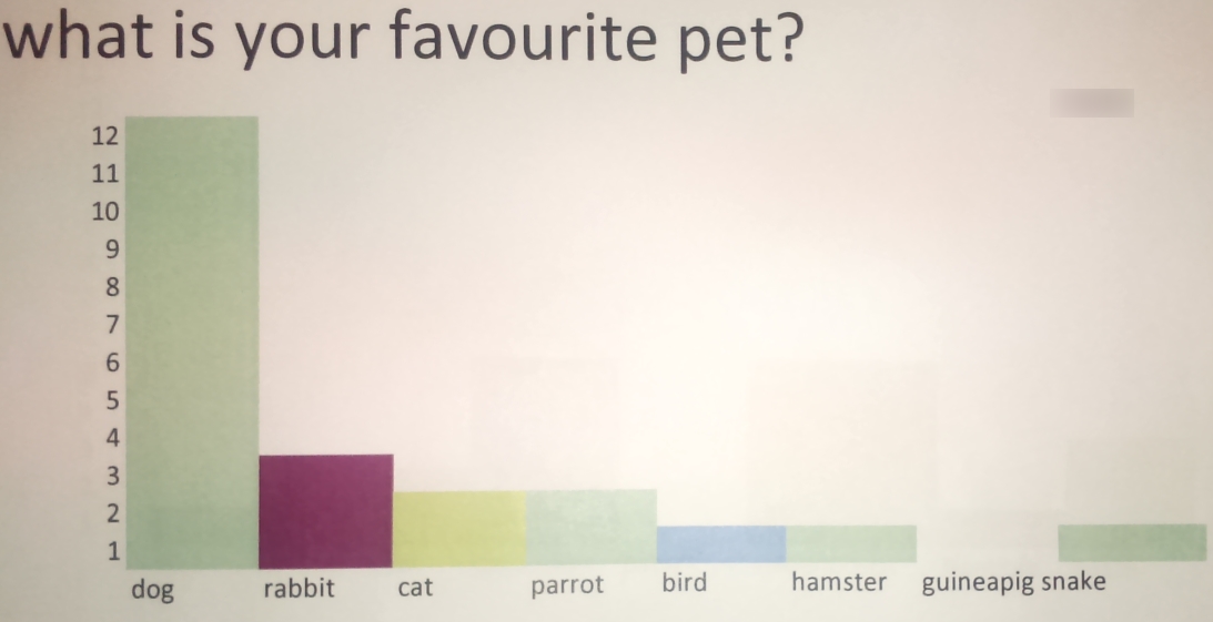
For the charts, we asked the students to survey their classmates about a favourite something. This could be a favourite food, a favourite sport, favourite hobby, and so on. They wrote out their survey answers in any way that they wanted on paper, then brought their results to the computer lab. From there, I explained how to lay out a bar graph by manually shading in the cells. I believe building this bar chart from scratch rather than using the insert chart option is important so that the students gain the understanding that the shaded cells are representing a number. Here are a few more examples of the charts close up:
After this lesson, we have now gone on to learn about creating graphs using data in Excel. This survey, however, has been very important to get our students to understand the meaning of a graph - a picture that gives us information.


No comments:
Post a Comment